Adaptive Branding
Why does a company change the look of its branding? Not all brands update the look/feel of their logo. Many choose to stay the same and embrace their past while many others re-brand as they grow. GAP Promo works closely with our client’s brand standards and, as we see all the variations, we thought we could share a little about why a logo changes.
A logo is not just a symbol of the brand personality. It’s also a great way to understand the personality behind the consumer. If a company chooses to re-brand, you can bet the consumer has also changed. A new generation of consumer may be the real reason behind a brand change, but many factors play a role.
As companies work to stay in the forefront of the industry and re-invigorate their identity, they may decide to target a new audience or bring in a guest designer for signature designs. This can range from limited edition graphics to completely re-imagined versions of their brand.
We see this currently in Hennessy’s branding. Collaborating with guest artist, Vhils, to create a limited series of 100 one of a kind packaging designs https://www.hennessy.com/us/life/vhilsdeluxe/
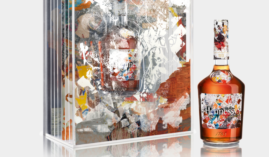
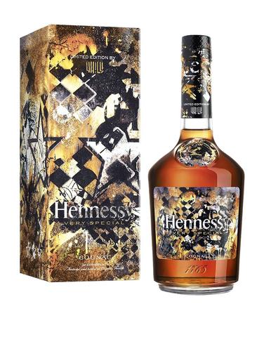
This partnership bridges a gap between Hennessy’s older urban consumer and the younger, street art cultured consumer- reaching out to the past and present at the same time.
Pabst Blue Ribbon has taken the idea of custom art branding to a new level. Since 2014 they have had an online contest to design a custom can. http://pabstblueribbon.com/art/
Not only engaging their consumer with ever changing designs, they are supporting art communities that speak directly to a younger audience through this initiative.
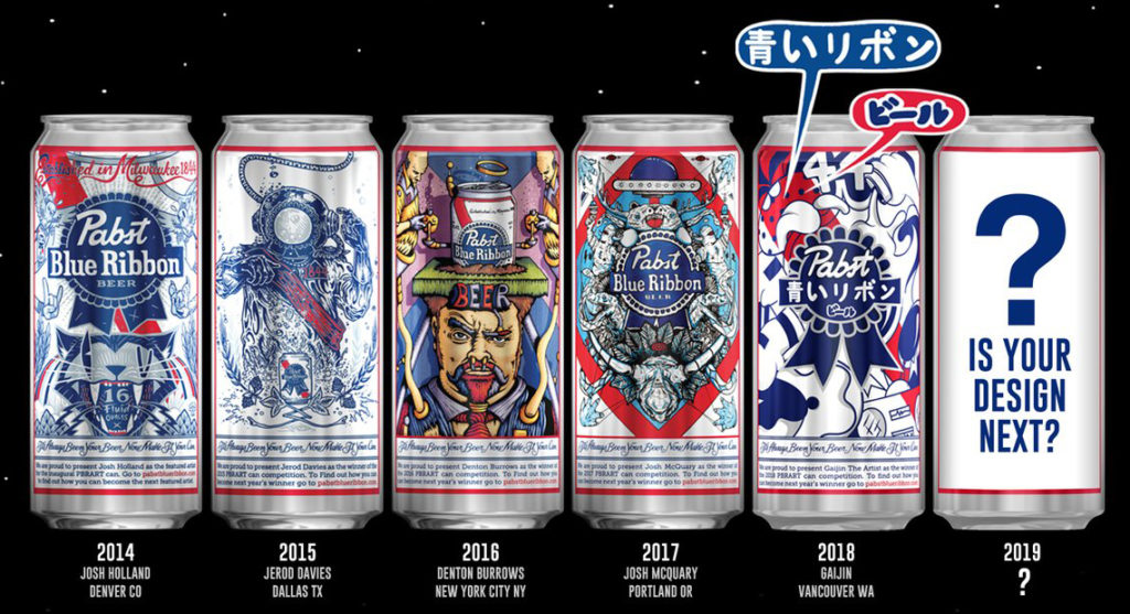
Some amazing illustrations that have won since 2014.
Trends in the art & design world will come and go, and brands can choose to embrace these trends, adapting them to their designs and changing as they change. This concept allows a brand to stay in the moment and gain a new audience they may have otherwise missed out on.
The classics vs. the new generation
Although brands are known to change their identity, some embrace their past with throw-back designs, bottle shapes and campaigns. We’ve all seen the classics reborn again. It’s a great way to reach out to your faithful consumer and give a nod to the hay-day of the brand.
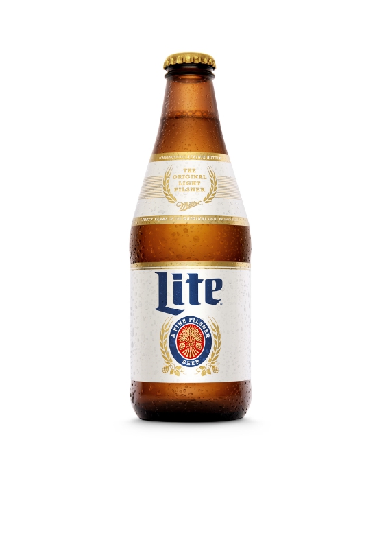
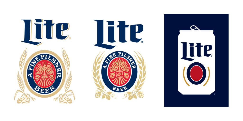
Take, for example, Miller Lite and their original Steinie bottle. https://www.millercoorsblog.com/news/original-miller-lite-steinie-back/
Producing their original shaped bottle was a smart shout-out to their older consumer base, but it also worked very well for the younger generation that pines for a retro experience when enjoying drinks with friends. Again, this type of approach speaks to all levels of consumer, young and old.
New communication
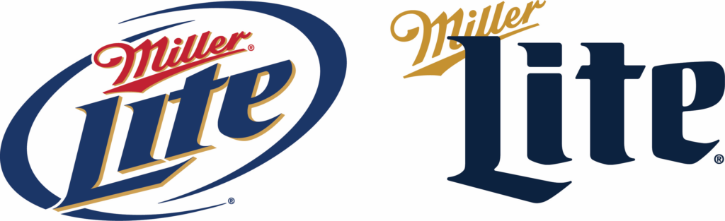
MillerCoors is a great example of how a company investigates the new ways contemporary design can communicate. Both Miller Lite and Coors Light have simplified their logos- taking a simple and stripped-down approach to their marketing communications. Iconographic designs are created by using simple, yet smart, design decisions to tell the story. While elaborately illustrated logos are still used today, the icon style has become a fast-growing trend.
You can see how Miller Lite still uses the same layout and look/feel as their retro logo in their newest version, but now it reads much faster and cuts through the busy details to get right to the heart of the logo. Take a look at the way it has evolved over the years.
Coors Light has also taken this approach, streamlining their mountain range logo to a simple design.
Both of these brands are still holding true to their past designs. Their new look embraces their long history while taking their brands into the 21st century.
GAP Promo is here to help your brand gain the attention it deserves. Our job designing promotional products and brand solutions that follow our client’s evolving brand standards start with our passion for design and history. Let’s tell your story.